.avif)
Top 5 data visualization tools of 2026
Looking to stay at the forefront of data management in 2026? Look no further! Explore our handpicked selection of the top 5 data visualization tools. These user-friendly tools make managing complex data a breeze and boost your online spreadsheets, making your data more organized and visually engaging. Let's dive in!
.avif)
In the ever-evolving landscape of data management in 2026, maintaining a competitive edge is paramount. Look no further, as we present our carefully chosen selection of the top 5 data visualization tools. These advanced tools aren't just user-friendly; they are your key to seamlessly navigating complex data sets. Additionally, they elevate your online spreadsheets, transforming them into meticulously organized and visually engaging assets.
Join us as we embark on a journey to explore these transformative data visualization tools, poised to enhance your data management skills. 🚀
Table of contents
- What is data visualization?
- Importance of the data visualization
- Benefits of data visualization
- Who needs data visualization?
- Top 5 data visualization tools of 2026
- Frequently asked questions
What is data visualization?
Data visualization; It is the practice of translating data into a visual context, such as a graph, to make it easier for the human brain to understand and gain insight. It refers to the techniques used to make the data in graphs understandable by coding them as visual objects.
Data visualization is the graphical representation of information and data. Data visualization tools that use visual elements such as charts and maps; allow us to see trends and outliers in the data.
In the world of big data, data visualization tools and technologies are crucial for analyzing large amounts of information and making data-driven decisions.
The main purpose of data visualization is to make it easier to identify:
- patterns in large data sets
- trends in large data sets
- outliers in large data sets
The term is often used interchangeably with others, including infographics, information visualization, and statistical graphs.
Once the data is collected, processed and modeled, visualizing it to reveal the results is one of the steps in the data science process. Data visualization is also an element of the broader discipline of data presentation architecture, which aims to describe, find, format and deliver data in the most efficient way possible.
Data visualization is extremely important in almost every field. It can be used by teachers to view student test results, by scientists researching developments in their expertise, or by managers who want to share information with their team. It also plays a crucial role in big data projects. As businesses accumulated massive data collections in the early years of the big data trend, they needed a way to quickly and easily review their data. Visualization tools have made their job much easier.
Data visualization is at the heart of analytics. When a data scientist writes advanced predictive analytics or machine learning algorithms, it becomes important to monitor the results and visualize the outputs to ensure the models are performing as intended. This is because visualizations of complex algorithms are often easier to interpret than numerical outputs.
Importance of the data visualization
Data visualization is included in many business intelligence tools and is crucial for advanced analytics. It helps people understand all the information or data produced today. With the help of the data visualization, information is presented in, for example, a pie or bar chart or another type of visual presentation.
Good data visualization is essential for analyzing data and making decisions based on that data. It allows people to quickly and easily see and understand structures and relationships and to detect trends that can not be noticed in tables consisting only of raw numbers. In many cases, no special training is required to interpret what is presented in the charts, ensuring universal understanding.
A well-designed chart not only provides information, but also enhances the impact of that information with a powerful presentation, attracting attention and holding people's attention like no spreadsheet can.
Benefits of data visualization
- Data visualization allows us to understand information quickly and clearly. Thanks to graphical representations, we can make large volumes of data understandable and visualize them in a coherent way. In this way, it helps us retain information, draw conclusions and insights, save time, and solve problems more efficiently.
- The presentation of infographics and data allows us to identify relationships and patterns within digital assets. Because discerning trends in data, and factors that can impact product quality or help us solve larger problems, data visualization makes you stand out among your competitors.
- Data storytelling allows us to develop a new business language so we can share our story with others. Data visualization is a medium through which we can uncover new insights and interact with others with the help of analytics.
- Data visualization provides us with analysis at various levels of detail. People want evidence of the underlying analysis; Even if they don't understand the collapse of analytics, they want proof that there is data behind it because these stories are more compelling than just a personal experience.
Who needs data visualization?
Data visualization is widely used in many fields, from business to science and research. Businesses can use data visualization when analyzing financial data or trying to understand customer behavior. Scientists may choose to visualize complex scientific data to make it more understandable. Educators can use data visualization to evaluate student achievement or communicate educational data.
Top 5 data visualization tools of 2026
- Plotly
- Infogram
- Retable
- Tableau Public
- FusionCharts

Plotly
Plotly data visualization tool helps you create charts that you can share online rather than traditional charts. It has a very easy-to-use interface. You can sign up for Plotly for free. You can use the library without signing up. You can get training in data analysis. For Plotly, you can visualize your data and publish the data you create online.
Pros
- You can create beautiful, interactive, exportable charts with just a few lines of code.
- It offers a variety of interactive features such as zooming, panning, and hover effects, allowing users to delve deeper into data and gain valuable insights.
- It produces visually appealing graphics with high-quality visual assets.
- Plotly's library offers a wide range of customization options that allow users to fine-tune the appearance of their visualizations.
- It creates professional-looking graphics by providing comprehensive control over visual elements.
Cons
- The setup is confusing due to the large amount of code to write.
- Outdated documentation and the wide range of Plotly tools make it difficult to get used to it.
- Some customization options require complex and technical solutions.

Infogram
You can create graphs and tables with Infogram, one of the best data visualization tools. It is also a very suitable tool for creating visuals such as maps. You can easily share your data online with Infogram. This data visualization tool allows you to connect your visualized data with big data. It is suitable for teamwork with its collaboration capabilities. You can also share your data in different file formats.

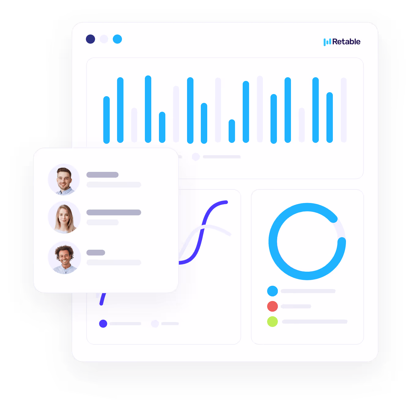
Retable
Retable is an online spreadsheet tool that offers you various advanced data visualizations with smart data views that work synchronously with your online spreadsheets. Retable, also known as the best Airtable alternative, not only visualizes your data but also allows you to collaborate with your team on the data you visualize. With its real-time collaboration capabilities, Retable provides a secure database for you to work with your team on the most up-to-date data, while also making it easier for you to get visual insights from your data.
Retable online spreadsheet tool, which allows you to store your data in various formats with +30 column types, transforms your data into smart data views such as grid, list, card, kanban, chart, map, form and calendar, thanks to these column types. Thus, it serves not only as a data visualization tool but also as an app platform where you can create small business applications.
Pros
- In addition to data visualization, it also serves as an online spreadsheet and database.
- It allows you to create an unlimited number of workspaces and projects.
- You can manage your teams' access and roles.
- You can share all data tables publicly or embed them on your website.
- You do not need to import data every time, you can work directly on Retable. In this way, your other data views where you visualize your data will instantly work in sync with your Retable database.
- You can easily collect data through online forms
- You can provide real-time data streaming by integrating Retable with different tools via the Public API.
- With the help of many integrations like Zapier, Make.com, Pabbly, Integromat etc, you can feed your Retable data views from different data sources or sync your data in Retable with different tools.
- You can enrich your data with ChatGPT integration.
Cons
- Since the webhook feature was developed recently, it does not allow to use of advanced triggers and actions, but developments to improve it continue.
- You cannot create charts on an account basis, each chart view is specific to the table. However, a feature that allows you to create dashboards with data from different Retable tables is under development.

Tableau Public
Tableau Public is a good option for data visualization. Tableau Public is super easy to use. With this data visualization tool, you can perform all kinds of data visualization easily and quickly and no coding knowledge is required. In addition to the free version, there is also a paid version with more advanced features. You can combine different data such as Excel and PDF, as well as visualize your data seamlessly by creating tables, graphs and maps.
Pros
- You can share your data publicly. Published data visualizations are available for anyone to see online.
- It's free with few limits. You can axplore and contribute to the millions of visualizations for free.
- It is fully hosted. Tableau Public can handle millions of viewers. All infrastructure is managed by Tableau at no cost.
- You can create custom maps, charts, and graphs in clicks.
- Tableau Public provides a user-friendly drag-and-drop interface.
Cons
- You can't connect to other servers such as Tableau Online or an Internal Tableau Server. You can only connect to Tableau Public.
- Data connectors are limited. You can't save a workbook locally to your computer, and you can only publish to Tableau Public.
- Tableau Public can only read data from a few sources but Tableau Desktop can read from a lot more.
- Tableau Public has a limit of 10 million rows of data that is allowed in any single connection.
- Each account owner can save up to 10GB of content to Tableau Public.
FusionCharts
FusionCharts is a more comprehensive data visualization tool compared to other data visualization tools. It is suitable for users who want to create dashboards in their projects. It has a wide range of maps, graphics and visualization features. This tool, with which you can transform your data into different visuals, generally works with large amounts of data. Dashboards created with FusionCharts have many font options. You can also create comprehensive and detailed documents with this tool.
Pros
- FusionCharts has lots of customization options, you can create attractive charts and graphs.
- It's easy to extend with custom annotations and custom functions when you click on part of a graph.
- FusionCharts has more features than most other data visualization tools. It has many chart and map formats. It also integrates with a variety of different programming languages, a feature not available in most tools.
Cons
- It is quite expensive when compared to other data visualization tools.
- The documentation is a bit out of date.
- Setup is complicated.
Frequently asked questions about data visualization tools
What are the most basic data visualization methods?
The five main types of data visualization methods are as follows:
- Temporal data visualization
- Hierarchical data visualization
- Network data visualization
- Multidimensional data visualization
- Geospatial data visualization
What are the types of charts that can be used for data visualization?
Here are some commonly used types of data visualization: Charts and Diagrams: Graphs such as line charts, column charts, scatter charts, and pie charts are frequently used to visually represent data.
What is 3D visualization?
3D visualization is the process of drawing a 2D drawing of an object in 3D and turning it into an image. There are many areas where 3D visualization, which has an important place, especially in architectural and interior design studies, is used.
How many types of data models are there?
There are basically three different types of data models:
- Conceptual data model
- Logical data model
- Physical data model
What charts can be used to visualize the distribution of data?
Histograms offer an effective way to visualize the distribution of values in a data set.
What is a data chart?
The method of expressing numerical data with lines is called graphics. Graphs visualize numerical data and allow comparisons to be made between them. Thus, it is possible to understand and interpret numerical data.
more
Related Resources


Create your smart data management solution
Plan, track, and analyse with your ease. Transform your data with an all-in-one platform, collaborate with your teammates.
Try for free!